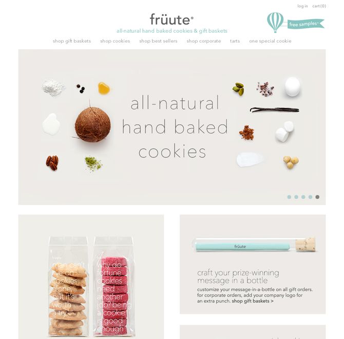
Background images might not be the first element you consider when designing an ecommerce website, but these types of graphics are crucial for pulling together a site design and improving the overall look, feel and functionality of your online store.
The right background image will be a workhorse for your ecommerce site, helping to make the design appear more unified and professional. Background graphics can also help direct the UX pathway of your website, drawing the eye towards calls-to-action or buttons, using subtle changes in gradients, textures, and color contrast.
An ecommerce site design can benefit from five types of background image:
- “Edgeless” background images that aid responsive design.
- Background images with visual cues that direct the UX pathway.
- Background textures that bring a sense of depth and aspiration to digital images of products.
- Background images for product mockups, which allow sites to replicate the tactile experience of physical retail.
- Thematic background images that help reinforce the brand identity or type of products for sale.

Choosing Right Background for Your Brand
Use the Right Tools
Firstly, find the perfect background for your brand’s website, it helps to begin with the right tools to ensure your success.
We’ve all probably seen a few sites with multiple bright colors used together (neon green and fluorescent pink, anyone?) or with an obnoxiously distracting image in the background. Or you may have seen sites where the font color is too close to the background color, making it impossible to read the copy. While you may be aware of some of these common design faux pas, it isn’t easy to create a background that follows all the rules.
In other words, if you don’t have a design background, picking and choosing colors and textures can feel like a daunting task.
Reflect Your Brand with Website Background
It’s important that whatever you choose for your website background should be cohesive with your brand. That means using the colors that you already use elsewhere for your brand, whether that be on social media, in a brick-and-mortar store or pop-up shop, or another branded website.
For example, if your brand is more formal or corporate, it doesn’t make sense to use a playful or edgy background.


